Vizú: AI for fashion that transforms images into product attributes
Product & Brand Case Study — UX & Visual Design
Objective
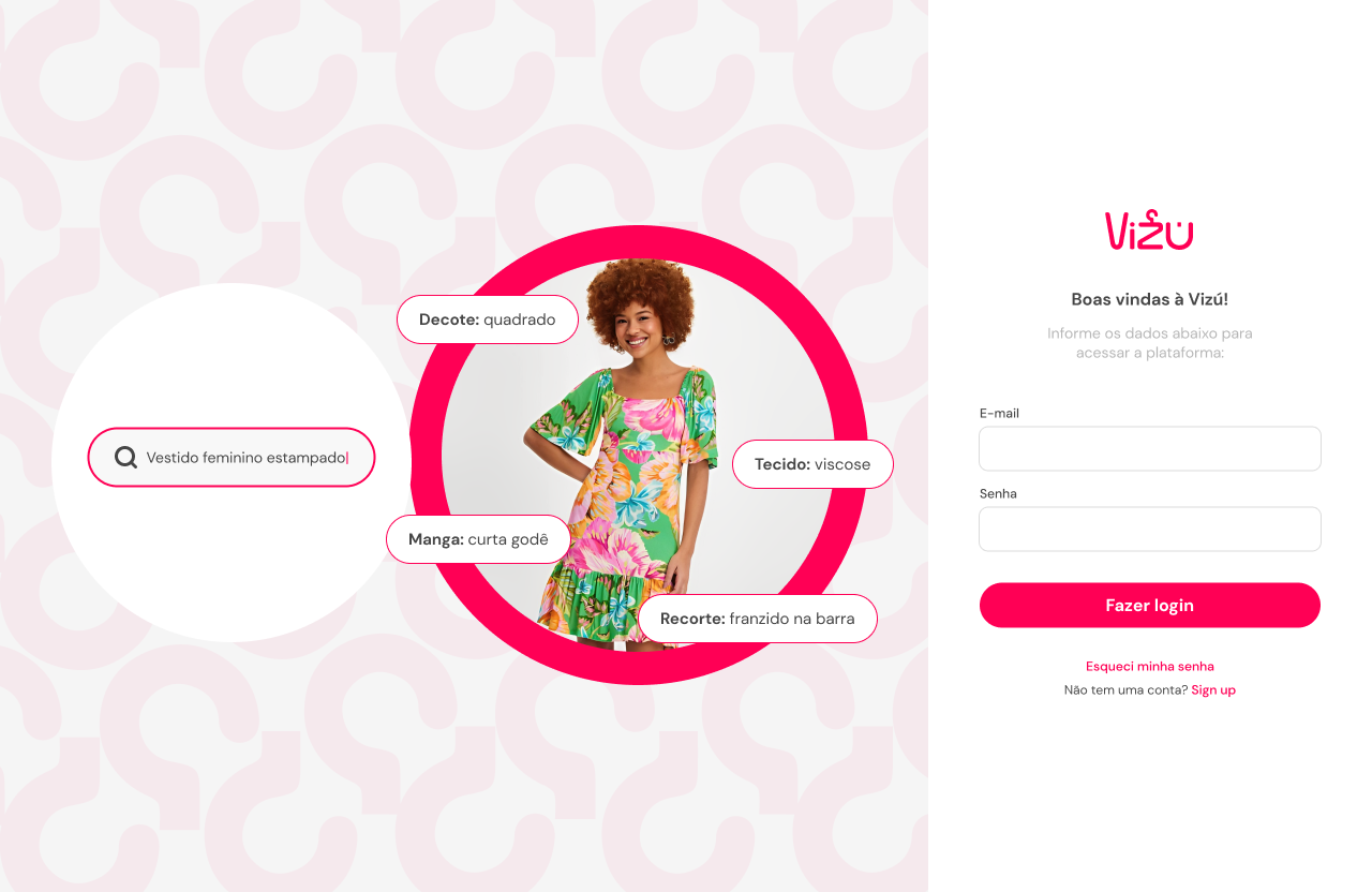
Create an artificial intelligence platform for fashion, capable of reading images of clothing items and automatically returning complete descriptions and attributes (e.g., “green dress, high neck, long sleeves, velvety texture”).
The system was designed for e-commerce operators responsible for feeding the catalog of large retailers, reducing registration time and ensuring consistency.
Business context and challenge
Fashion e-commerce in Brazil faces challenges of low conversion rates due to incomplete or non-standardized descriptions.
Overworked internal teams, dependence on paid traffic, and a lack of standardization of attributes hinder SEO and search.
The contractor saw AI as an opportunity to standardize and enrich product data, preparing the solution for players such as C&A and fashion marketplaces.
My contribution
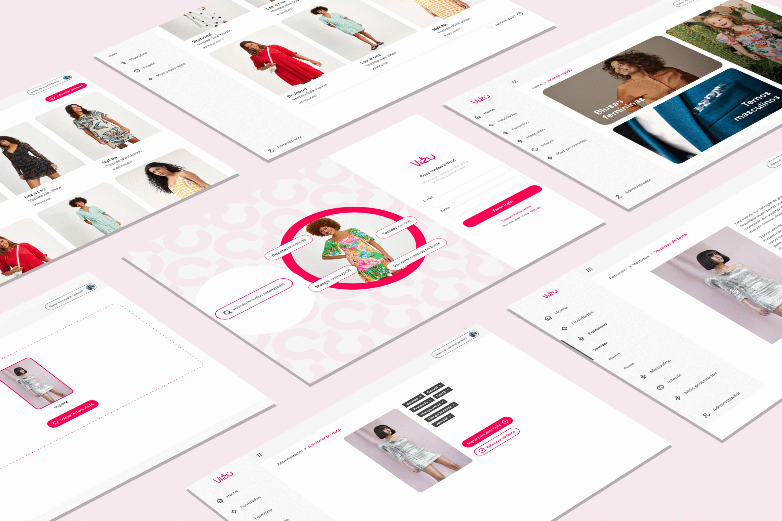
Platform UX & UI (desktop): I designed the product registration, image upload, and automatic attribute return flows.
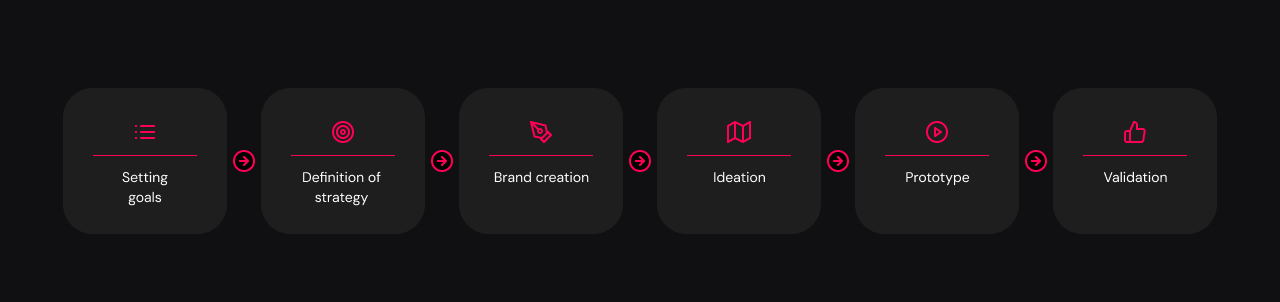
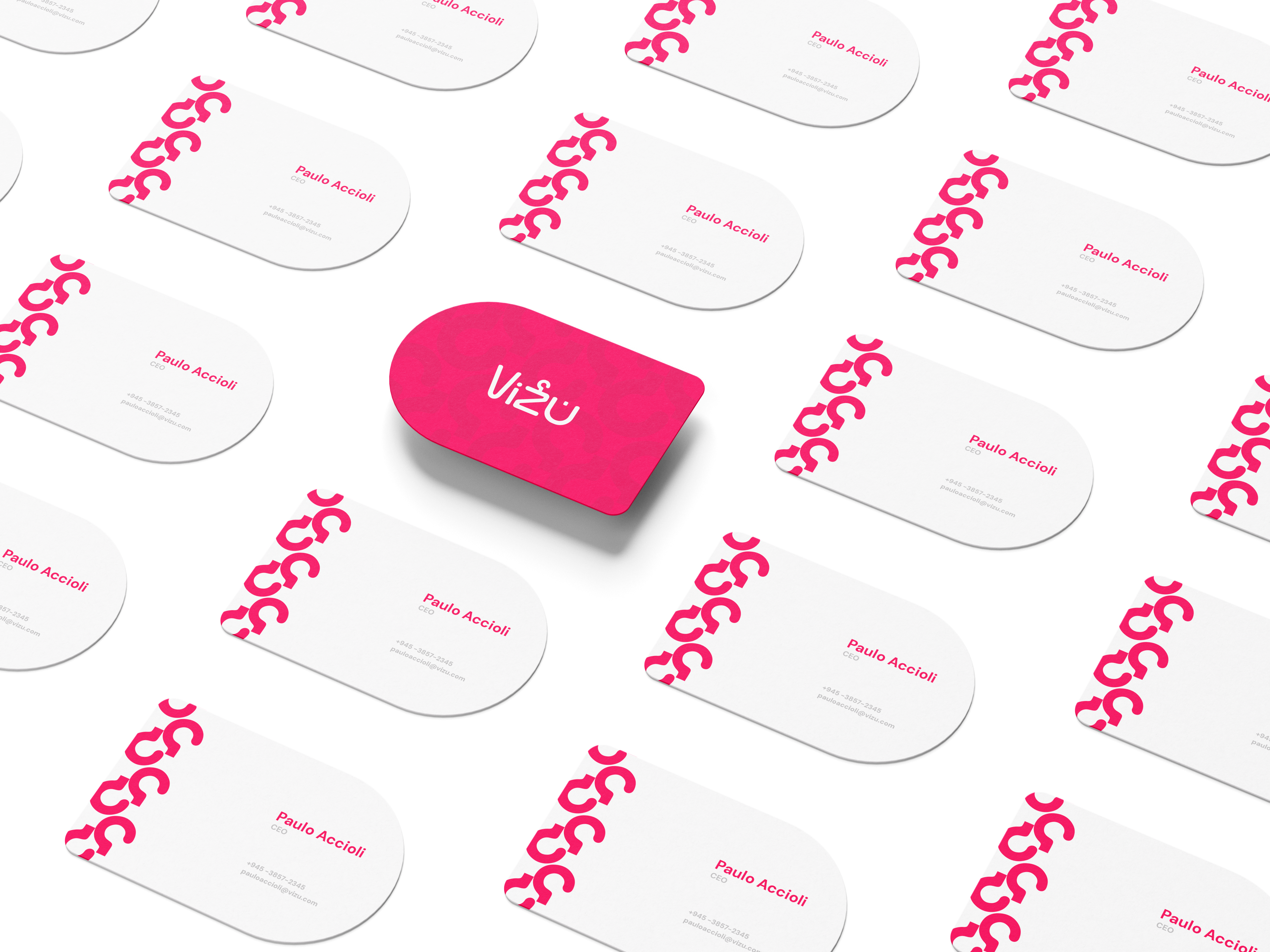
Vizú brand design: I created the visual identity (logo, colors, typography) in collaboration with another designer, ensuring consistency between branding and digital product. Interaction architecture: I organized the operator’s journey (upload → AI reading → attributes → ready description).
Prototyping: I presented wireframes and high-fidelity screens for the client to validate usage scenarios.
Design principles applied
Simplicity for operators: reduce the learning curve with clean, straightforward screens.
Visual clarity: use bright colors for critical actions (upload, start AI reading, complete registration).
Flexibility: allow both automatic insertion (via AI) and manual attribute adjustments.
UX Decisions & Trade-offs
AI as default, but with manual editing → efficiency without losing human control.
Desktop-first interface, since the target audience was internal staff, not end consumers.
Bold brand identity (pink + rounded typography) → differentiation in the market, but required care to maintain legibility during prolonged use.
Restrictions & Limitations
Target audience: B2B (e-commerce operators), with little tolerance for complex interfaces.
Need to gain credibility in an industry that is still skeptical about AI.
Remote and rapid collaboration with another designer, adjusting branding and product in parallel.
Expected resultations
As a project in the presentation phase to potential customers, the main estimated gains were:
Productivity: reduce registration time by up to 70%.
Consistency: standardization of descriptions and attributes, improving SEO and internal search.
Scalability: ready integration with platforms such as VTEX and Shopify.
Lessons learned
Designing for internal users (operators) requires a focus on simplicity and clarity.
Strong branding helps convey credibility even in technical B2B solutions.
Collaboration between product design and brand design enriches the final result.